Tuesday, 10 January 2012

Foundation Portfolio Evaluation

My magazine is an R’n’B music magazine so I based it around the conventions of other R’n’B magazines such as “VIBE”. The main convention that is noticed on an R’n’B music magazine is the bold masthead that often is placed behind the image of the artist on the front of the magazine. 


This convention is normally used to show that the magazine has got a high status and that an audience will recognise the masthead even though half of it may be covered by an image. I used this convention in my media product as it makes the magazine look more professional and important and an audience will be familiar with the look so they will know what kind of content to expect from the magazine. Another convention that is common in R’n’B magazines is the mise-en-scene used in the images on the front cover. Generally the mise-en-scene in R’n’B magazine images involve the serious expression of the artist on the front cover this makes them look intimidating, which relates to the type of music they produce as a result of being an R’n’B artist. It also includes the relevant type of fashion that that is considered admirable by the audience also showing that the artist’s life, talent, style, etc. is admirable. I used this convention in my media product as it makes the audience want to aspire to being more like the artist on the front therefore more willing to buy the magazine in order to gain this aspiration. The conventional colour scheme of real R’n’B music magazines is normally quite simple but very bold this makes the magazine stand out but also professional and tidy while easier to read. I incorporated this convention into my media product by keeping the colours throughout all three pieces to three colours. The last convention I used in my media product is the way that the artist’s name is bigger than any of the sell lines which shows the success and high status of the artist.

My media product represents a particular social group by using particular conventions associated with that social group. Such as I used a young male and the mise en scene of the images throughout the pieces relates to the age group and gender that are interested in the type of magazine my media product is because they are able to relate to someone their own age, gender and image. Also the type of fonts I used in my media product also appeals to a male audience as it is very masculine this relates to the images throughout the three pieces as they are also more appealing to a male audience. This is quite a typical representation of a young male audience as it is used in many other magazines such as XXL.


The media institution that will distribute my media product will be a company called RedActive Media Group. They seemed the most suited publishing house as they are able to publish your magazine however frequently you would like. Their advertising base is also quite good meaning that they will have no problem raising the status of my magazine. One of the main reasons I chose this publishing house was because they were able to offer a variety of services, such as leaflets, medical journals, etc., meaning that the company is very competent and will be able to handle to design a music magazine that will appeal to the target audience I want it to appeal to. http://www.redactive.co.uk/

My target audience is young males from the age of sixteen to the age of twenty-five. I was able to suit my magazine to this target audience by using masculine fonts that will appeal more to males. Also by using a young male artist I made the image and content relevant to this target audience as they are able to relate and aspiring to be this artist. The sell lines also appeal to the target audience as this is what young males would like to read about. My magazine also follows R’n’B music magazine conventions making it more appealing to my target audience as this is the type of magazine they would most likely be interested in.

The main way I aimed to attract my target audience is by using mise-en-scene in the images throughout the pieces to create an image that is relevant to the target audience age, gender and taste. The target audience will be more likely to but a magazine with someone on the front cover they can relate to or aspire to be. Also I used sell lines that will interest and relate to my target audience such as ‘New addition to young money?’ which is a relevant group to young males and they would like to read about it. Also the mode of address used is related to the way most young males would speak or write themselves meaning that it is easier for them to enjoy and read. The articles including inspirational stories of rising artists will satisfy the reader of my media product as it relates to the title of my media product, ‘Arise’. An audience would most likely like and buy my media product as it has the same conventions as a R’n’B music magazine however it includes a more fulfilling content to help inspire the audience.


I researched popular existing magazines such as Choice FM’s own magazine ‘Music Potential’ which advises young people on how to enter the music business. I was able to incorporate this into my own magazine. I also constructed a questionnaire that allowed me to understand the wants and needs of the target audience and based the design of my project around these wants.


Final products


I have gained knowledge of Photoshop during the completion of this project as I have never used it before so I learnt the basic workings of the programme and was then able to apply that to my work. I was able to use the resources in Adobe Photoshop to create the effect I wanted in my magazine by using the airbrush tool, contrast, etc.

My knowledge of creating a blog has also improved as I was able to create and use a blog effectively to showcase my project. 

From completing the preliminary task I was able to learn how to produce a magazine that appealed to the specific target audience. By researching the target audience and other existing magazine that are targeted at the market I was able to base the preliminary task around my findings. This helped in the final project as I knew how to go about finding out about my target audience and how to apply it to the production of my final project. I was also able to improve on certain aspects that I did in the preliminary in my final project such as my use of Adobe Photoshop. Also my knowledge of magazine conventions was broadened and was therefore able to apply this to my final project. Overall I have learnt how to use Adobe Photoshop effectively, how to apply music magazine conventions to a magazine to attract a target audience, how to apply to a certain target audience through use of research and then later apply it to the making of the product. 


Thursday, 15 December 2011

Tuesday, 13 December 2011

Mock Up - Contents Page

The image of my artist is with his back to the audience making him seem detached and uninterested making him seem cool and important. I also want to keep the layout of the page simple like the image so that it keeps all attention focused on the artists image. I will edited this image to just having the artist in the background with a grey background.

Monday, 12 December 2011

Saturday, 10 December 2011

Artist Profile

Imenz is the stage name used by the new up and coming artist George Foster. He is 15 years old and has been writing his own music, along with his friend of four years Andre Noel, for a year and a half and has finally released his new mix tape ‘Painted Over’. His music is a new take on the R’n’B genre as he does not have the common references to money, cars and fame but talks more about moral issues and achieving the best that you can in life. He aims to be a stable role model for the youth in a hope that they will choose the right path and he hopes to achieve this goal by passing on his message through his music. He was recently signed to a small record label called ‘Above’ (February 2011) but wishes to be signed with ‘Young Money’. George’s interest in music came about through listening to other artists and releasing they did not have a real message and wanted to hear something that had a meaning behind it. In the future George wishes to be as big as Drake and Eminem.


Do you prefer to be called by your real name or your stage name?
“Well Obviously I like people who are close to me to call me George otherwise I am used to answering to Imenz”

What inspired your stage name?
“Well I took the word immensesne and improvised with it”


How would you describe your music?
“I would say my music is one of a kind. It holds a real message behind it, I don’t talk about cars and money. I talk about real issues in life.”

What type of person is your music aimed at?
“My music could appeal to any type of person. Its aimed at anyone who wants to listen to the message I want to spread.”

Where do you gain most of your inspiration for your music?
“Life experiences, my mixtape is almost a diary haha”

Who are the artists that/What inspired your love of music?
“I listened to people like Drake and Eminem who had real meaning behind their music, I wanted to do the same. Also I wanted to share my experiences with the world.”

What is the inspiration behind the name of your mix tape?
Well I’ve made many mistakes in my past and music helped me paint over them and start again, that’s why its called ‘Painted Over’

How much time do you spend on working on your music?
“I’m always working on my music, if any thought that comes into my mind sounds good enough to go into one of my songs, I’ll write it down somewhere.”

What type of environment do you like to work in?
“I can work in any conditions. In a loud, busy room to a quiet, ideallic park.”

How does Andre contribute towards your writing style and sound?
“He helps refine the things I’ve written down thourghout the day. And if anything sounds better somewhere else he’ll rearrange it.”

Is there any other profession you would like/wanted to do?
“Well I love artwork, I would love to paint full time, but I’ve always wanted to do music.”

Where would you like to see yourself in ten years time?
“I would love to move to America…Oh and have a number one albulm.”

What advice would you give to yourself before you got signed?

“Don’t give up hope, you’ll get some where soon”

Sunday, 20 November 2011

Reconnaissance


Helicopter pads are used as a form of showing success because if you are allowed at the top of the building you will either own it or be able to afford to use a helicopter as transportation. Success is the main focus in R'n'B lyrics and music. It can be seen as a metaphor; as if they are on top. It also places them in the city which emphasizes their urban edge.


The city at night shows the artist has an active nightlife. This could be seen as a sign of success as they are continuously being invited to different parties. It also implies that the artist’s music is influenced by an urban culture.  


A blank background allows all attention to be focused on the main image. It is also easier to edit as the background colour can be changed, objects can be inserted and shadows can be contrasted against the block background giving the main image a 3D look.


Costume Ideas

A black hoodie with a red logo is simple and doesn't draw too much attention away from the artist or masthead while allowing the artist to look relevant and on trend.


As I developed costume ideas I decided that a costume with more colour will suit my target audience better as it will attract them with the bright cheerful colours that make the magazine have a younger, fresher feel to it.


Costume Ideas

For the front cover of my magazine I would like the model to wear a purple hoodie. This will coordinate with the sell lines and masthead drawing more attention to them. The model will also be able to dress it up with a few iconography pieces, such as a watch or chain.


Costume Ideas

A typical look for R'n'B male artists is a simple black T-shirt. On many occasions they will have a slogan across the front. It will normally focus on their status as an artist, for example their name or something to do with money such as 'Get Rich'. They will also normally combine a simple T-shirt with silver or gold chains, sunglasses, watches, other Jewellery and hats or Bandana. All of these things are iconography for the R'n'B genre of music as they show off the artist success as they are able to afford to buy expensive things to wear. The simple black T-shirt contrasts with the extravagance  of the accessories draws more attention to them. 


Another common look for male R'n'B artist is the shirtless look. It is a well known symbol of masculinity and this is what many male artist brag about in their lyrics. It is also following the convention of 'sex sells' by playing on the sex appeal of the artists in the hope that the public will respond by buying whatever is being promoted because of the artist being shirtless and therefore 'sexy' and 'desirable'.


Mise En Scene


Thursday, 17 November 2011

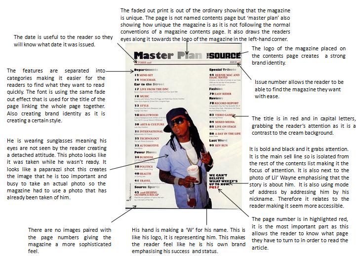
Double Page Spread Analysis


The article on the second page is arranged into three colums which follows music magazine conventions.

The article itself has a clear baseline giving it a neater look and making it easy and clear for the audience to read which will appeal to the audience. The text is in black also making it easy and clear for the audience to read as it is just plain and simple and nothing is costantly trying to grab the audience’s attention.

The pull quote is at the top left hand corner of the page, where the audience’s eye will be drawn to first, as people tend to read from left to right. The colour also stands out from the rest of the article as it is the brightest thing on the page including the pictures.

Drake’s sense of style appeals to the magazine’s target audience as it is modern and youthful. It represents the type of person that would read the article.

There are two images and there are one of each page which doesn’t follow magazine conventions as normally there is one main image on a double page spread and the article is spread out on the other page or around it. Also they both take up half the page making them a main feature of the article. This emphasises his status as an artist as he is able to have two images in one article whereas most artists have one.

The image on left hand side shows Drake in casual  attire and he is laughing. This gives the impression that he is not working but ‘hanging out’ which is a contrast to the black and white image on the other side, where he is working in a studio with a serious expression. Showing that Drake has two sides to him when he is working to when he is having fun.

The layout is simple which keeps the focus on the content of the article rather than distracting from it with bright colours or a variety of images placed around the article.


The image takes up a whole page and a part of the next page. It is dominating the whole spread showing how dominate the artist is. It also shows his status as he allowed to have a large photo whereas other artist that are not as established as him would not be able to. It is also almost as big as a poster showing that his fans admire him and would probably like to have a poster of him to put on their wall.

The graffiti in the background emphasises the urban culture he is surrounded by. It also looks similar to the tattoos on his arm suggesting that he is similar to the city and urban culture around him. He is not looking straight into the camera making him seem cool and detached from the audience, giving him a superior aura. The chains around his neck look as if they are weighing him down, emphasising their value showing the success of the artist.

The artist name is in the top left hand corner of the page which is a main focus point as an audience tends to read from left to right.

The first couple of words of the text are a lot bigger and a different colour than the rest of the text making them stand out a lot more and drawing the reader’s attention to the beginning of the text and making them want to see how the sentence will finish. It is like a teaser of the text.

The pull quote is in black at the bottom and in big bold letters. It draws your attention to it. The content of the quote makes the reader want to find out what else is said about the topic. It gives away enough information for the audience to become interested but not enough for them to be satisfied causing them to want to find out more by reading on.

The actual body of text is arranged in simple columns only breaking for new paragraphs so it does not draw attention away from the content of the text by using bright, bold colours and fonts.


Wednesday, 16 November 2011

Sunday, 13 November 2011

Front Cover Analysis

In order to create an effective and relevant front cover I need to understand why and what certain methods are used on the front cover of an R'n'B music magazine. Therefore I have analysed two magazine front covers similar to the genre I wish to create my own music magazine. I have commented on colour schemes, sell lines, mise en scene, ect. and how they effect the audience's view of the magazine.

Monday, 7 November 2011

Questionnaire Results

Questionnaire Results
What age group do you belong to?

All candidates answer with 12-16 so I will have to tailor the magazine to this age group.

Are you male or female?

The majority of my focus group are males so the magazine will have to appeal to a male audience. I can achieve this by using appropriate fonts, images, colours and articles to draw in their attention.

What feature of a magazine would interest you most? (Reviews, Interviews, Etc.)

As interviews was the reply that came up the most I will use this to attract my target market by interviewing the artist that will appear in the magazine.

What genre of music are you most likely to listen to?  Tick one.


R'n'B was the answer given the most so the type of artists, features and music featured in the magazine will relate to this genre of music in order to attract the majority of the magazine's target audience.


What type of magazine would you say you read the most? Tick one.


As music magazine was the main answer I will I will follow the conventions of a music magazine in order to make my target audience become comfortable with the layout and look of my magazine therefore making it more appealing to the target audience.


Where are you most likely to buy a magazine? (Supermarkets, News agents, Etc.)


Newsagents and supermarkets are my target audience's main source of magazines so I will have to make the front covers of my music magazine appropriate to be sold in this environment. By making it friendly to all areas of the public and making it stand out on a shelf.

How much would you be willing to pay for a music magazine? (Between £2.00 and £5.00)

As most of my target audience are still in education so they are are not willing to pay over £4 but are willing to pay around £3 for a good quality music magazine as it is a keen interest of theirs and find that it is worth the money.

How often would you like the magazine to be issued?


My target audience would prefer to have a monthly issue as there will be more content in the magazine as it will cover a larger amount of time meaning that more has happened in the world of music. It also allows it to become more of a treat than a thing of everyday life making it seem more exclusive.

What colours would you prefer on the front cover? (pick three)


Purple, Black and White were chosen for the reason that it looks sophisticated but young at the same time. It will appeal to the type of people in my target audience.

Do the features in the magazine matter in your choice of magazine when you like the artist on the front cover?


As the answer was mainly yes I will have to gather some features that will attract the type of people in my target audience. Such as gigg dates, interviews and reviews.

What type of ‘freebies’ would appeal to you more?


The target audience said they would appreciate any type of 'freebie' that is associated with music as it will tie the whole magazine together and give it a more professional, official feel.

Sunday, 6 November 2011

Questionnaire

Questionnaire

1.       What age group do u belong to?  Tick one.
         12 – 16
         16 – 25
         25 – 35
         35 – 40
         40 – 50
         50 – Onwards

2.       Are you male or female?
         Male
         Female

3.       What features of a magazine interest you the most? (Reviews, Interviews, Etc.)

4.       What genre of music are you most likely to listen to?  Tick one.

         R’n’B
         Hip Hop
         Classical
         Rock
         Heavy Metal
         Indie
         Pop
         Rap
         Alternative
         Other   -  Specify:


5.       What type of magazine would you say you read the most? Tick one.

         Music
         Lifestyle
         Gardening
         Cooking
         Fashion
         Cars
         Other   -  Specify:


6.       Where are you most likely to buy a magazine? (Supermarkets, News agents, Etc.)


7.       How much would you be willing to pay for a music magazine?

8.       How often would you like the magazine to be issued?

         Weekly
         Every fortnight
         Monthly
         Semi-annually
         Annually

9.         What colours would you prefer on the front cover? (pick three)
·         White
·         Black
·         Pink
·         Blue
·         Purple
·         Gold
·         Orange
·         Yellow

10.   Do the features in the magazine matter in your choice of magazine when you like the artist on the front cover?

11.   What type of ‘freebies’ would appeal to you more?

Saturday, 29 October 2011

Music Magazine - Target Aundience

Target Audience

   The reader of ‘Arise’ is someone interested in music between the ages of 16-25. They are a person who is passionate about R’n’B music or music in general and wish to view it as an art form rather than a source of entertainment. They will be as passionate as the magazine about creating a better view of R’n’B culture in the way they lead their lives and the quality of the music they may create themselves.

   The reader of ‘Arise’ can be in any line of employment and can lead any kind of lifestyle (married, single, family). The thing that these readers will have in common is their passion for music.

   A motivated and inspired person will be the kind of reader that ‘Arise’ has. They will have strong opinions and get them across effectively but never forcefully. Their voice is always heard but they allow others to be heard as well. They are respectful and encourage other’s passions and interests. Even if they dislike something they will voice this by offering constructive criticism. Their interest in music is a main part of their personality and they seek out good quality music and are open to any type of music. They are an open-minded and imaginative person. They believe in giving everything an equal chance to prove its worth and are excellent judges of talent and character.

   The main hobby and interest of readers of ‘Arise’ will be music. Whether it be creating music or listening to it. However they will have a well rounded interest in the rest of the world, like sports, acting and etcetera. In their free time they enjoy expanding their knowledge in any area of life as they strive to be an educated, well rounded person. They enjoy being part of a diverse group of friends and value each one of them differently. They value family and spend time being a part of one.

   All types of music are of interest to the readers of ‘Arise’ as they are open to different kinds of art. However their main interest will be R’n’B music and this will be apparent in the way they seek out R’n’B music, or anything to do with R’n’B, through the use of the internet, other magazines, films and gigs or festivals.

   Overall the reader of ‘Arise’ can be any kind of person as long as they have a strong passion in music and aim to increase its reputation as a form of artwork.

Music Magazine - Genre

   The genre I have chosen for my music magazine is R'n'B (Rhythm and Blues). I have chosen this genre as it is a personal interest of mine so I am familiar with the genre. This genre is also popular with my age group so my research of the target audience will be accurate and useful. I also hope to create a different view of R'n'B by concentrating the magazine on the music rather than the image and reputation of the artist. 

Followers